One of the things people remember first about a brand is it’s colour choices. In this series of infographics we’ll be looking at what each colour says about a brand, how it makes people react and what message it sends. This infographic looks at the colour blue and the brand messages it promotes.
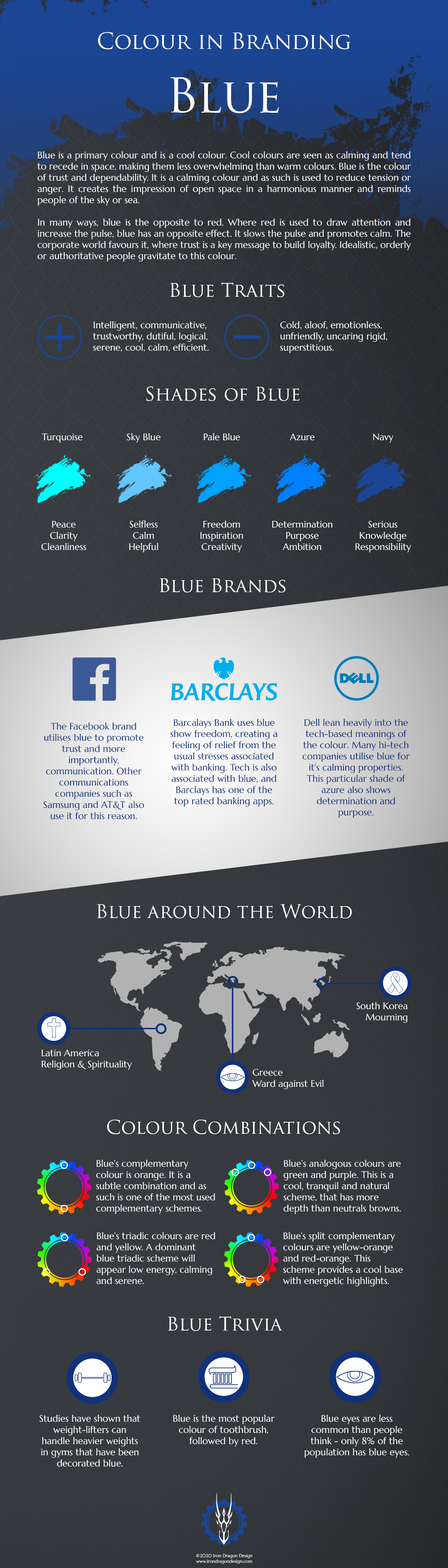
Blue is a primary colour and is a cool colour. Cool colours are seen as calming and tend to recede in space, making them less overwhelming than warm colours like red and orange.
Blue is the colour of trust and dependability. It is used to reduce tension or anger due to its calming nature. It creates the impression of open space in a harmonious manner and reminds people of the sky or sea.
In many ways, blue is the opposite to red. Where red is used to draw attention and increase the pulse, blue has an opposite effect. It is perfect for health and healing brands as it slows the pulse and promotes calm. The corporate world favours it, where trust is a key message to build loyalty. Idealistic, orderly or authoritative people gravitate to this colour. Check out the infographic below for some more facts about the colour blue.
Tips for using Blue
As with any colours, it is important to understand what your brand message is and whether your colour choices complement this. Blues are perfect for creating a calming image. Different shades also hold different meanings. Pale shades are seen as creative and inspire freedom and inspiration, while darker shades are responsible and serious. Azure is a determined and purposeful shade while sky is calm and selfless. Turquoise shows clarity and harmony and teal is a spiritual, sophisticated colour. It is important to understand exactly what shade you are using as there is a variety of possible messages that can be sent.
Blue does have a number of negative emotions associated with it. It can often be seen as rigid, conservative or predictable. At it’s worst, it is spiteful and self-righteous or unforgiving. At it’s best however, it is a colour that promotes calm and trust, so used well creates devoted brand loyalty and trust in a company.
Various parts of the world also hold a different meaning for it. In North America it is associated with liberalism, the opposite of it’s usual conservative roots in the UK. In Egypt and Greece it is seen as a spiritual colour that wards off evil and in China it represents immortality. Latin America think of it as a sombre colour associated with mourning and serenity.
If you are looking for more information regarding brand identity, contact us here.
Want to be updated on our latest news? Click here to subscribe to our newsletter and get our blogs right to your inbox.