When it comes to a brand, most people think of the visual identity first – and in most cases, the logo. Although it’s true that there is much, much more to a brand, there is no denying that good visuals are one of the most appealing aspects of a brand. So why, oh why, do so many brands fuck it up? And what can be done to make sure that your brand’s visuals are always battle-ready?
Look, I’ll say it now, one or two of the conclusions here are hardly going to be groundbreaking. But, when times get tough, a strong reminder of what a solid visual identity does for your brand is needed. So here’s an overview of what your visual identity is, and why you shouldn’t scrimp on it.
Visual Identity – Showing Who You Are, and What You Stand For
I liken your visual identity to a warrior’s weapons and armour. Going into battle without them is a bad idea. You might survive through luck and skill alone, but a sword and shield will make it easier! It’s the same with your visuals. I love a good strategy, but at some point you’re going to have to show it. And that’s just what a strong identity does. It shows your audience who you are and what you stand for. When done well, your visuals show your purpose and values. It makes it easier for like-minded clients to find you, and it makes you stand out from the competition.
And that’s what you want, right?
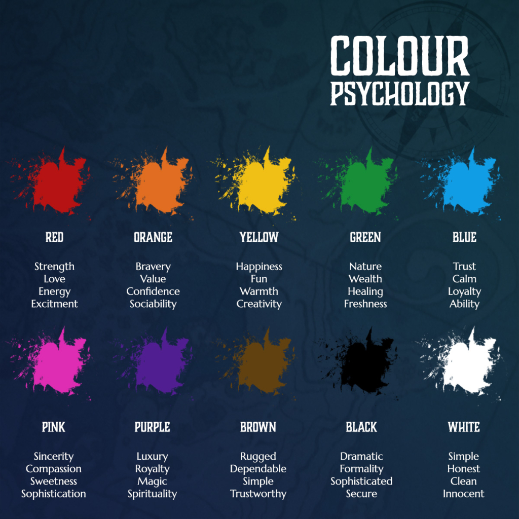
Your potential clients want to see what you’re about quickly. And your visual identity is key to sending emotive messages to them quickly. The colours and shapes you chose to reflect your brand hold meanings that your audience will pick up on. So it’s vital to get these right to provoke an emotional response in the audience. Want them to feel hungry? Use reds. Want them to feel safe and calm? Light blues are for you. Colour psychology plays a massive role here, so it’s important to know what your brand colours reflect before putting them out there.
In short, your visual identity is often the first point of contact. So it needs to show your ideals, fast.
Making a Difference
Another point is making you stand out. The visual aspects of your brand should look and feel different to your competitors. It’s no good copying your competition. Your clients won’t have strong feelings for your brand if they can’t differentiate you. People’s brand choices are heavily influenced by how they feel about the brand. If you don’t stand out, you’ll fail to make an emotional impact on your market. And that makes you forgettable.
There’s nothing worse than being forgettable in branding. It’s the first brand-killer.
Your visual identity is a great chance to show what makes you different from your competition. Use it to stand out and attract the kinds of clients you want to be working with. Looking for a youthful market? Use bright, exciting colours to get their imagination going. Want a more tech-oriented niche? Blues are often used in logic and technology.
But whatever you choose, make sure it does two things: makes you stand out and accurately reflects the brand. If you try to be unique without being truthful, you’ll cause distrust. The second brand-killer.
Being Real
Here’s the other big thing about your visual identity. It needs to reflect the brand’s ideals. We’re talking values, mission, vision, tone, voice. It all needs to be consistent. Creating brand visuals that promise something, then having starkly different interactions with potential clients, will lead to confusion (the third brand-killer). Confused clients aren’t going to buy from you. It’s that simple.
So how do you ensure your visual identity is truly reflective? Getting a strategist to review and align the brand never hurts. But you can also do your own research. Asking your audience questions on how the imagery makes them feel is a great way to gather data to help you understand how your visuals are perceived. This will let you tweak and modify visuals so the emotional beats match your messaging.
Putting it all Together
The visual identity covers so much, it’s sometimes tricky to know where to start. From logos to colours and the website to printed material, anything that uses graphical information is a part of your identity. And it all needs to be consistent! A consistent identity will build more trust and be more memorable.
To ensure consistency, it’s worth creating a list of visual touchpoints that a prospective client may come into contact with. Once you make this list, audit it and realign anything that’s off-brand. Your list of touchpoints might include:
- Logos
- Colours
- Typography/Fonts
- Website
- Social Media posts
- Printed items (business cards, banners, flyers, leaflets, etc)
- Signage
- Digital documents (e-books, one-pagers, headed pages, digital brochures, etc)
- Presentations
- Packaging
Honestly, there are too many to list; anything visual that represents your brand is fair game. Once you have this list, look at it as a whole and notice trends. More importantly, notice when something stands out. Is it good or bad that it does? Over time, you’ll create a huge amount of assets, and some older ones may not fit where the brand has evolved.
How to Use Your Visual Identity
The most important aspects of using your visuals correctly are, quite unsurprisingly, consistency, authenticity, memorability and uniqueness. If you can get these right, you’ll create a visual brand that is hard to miss, and harder still to forget. Many brands don’t review their identity until it’s too late, letting years pass while using multiple iterations of the brand. This is a surefire way to confuse the audience.
So, here are some tips to make sure your arms and armour are always ready for battle:
1 – Set up a review schedule
I’ve talked about the importance of reviewing before, but it bears mentioning again. Review your assets frequently. At least annually. You’ll be surprised at the changes you see in your visual identity, even during a year, as your designers get more comfortable with the brand. Take time to uncover any weak links and plan when to bring them into line with what you expect to see.
2 – Check in with your audience
Getting feedback on how your audience is feeling is a great way to notice potential problems with the visuals in your brand.
3 – Be aware of your competition, and DON’T copy them
Being aware of what’s going on around you ensures that you’ll be able to keep your visuals unique and focused towards your ideal target market.
4 – Don’t be afraid to prune off bits that aren’t working
If you notice something weaker in your visuals, don’t be scared to remove it. Pruning weaker elements gives energy to the stronger ones, letting them thrive and attract more clients.
If you effectively manage your visuals alongside your strategy, you’re much more likely to succeed. Keeping them well-maintained, like a suit of armour, will make you stand out and ready to face any challenge.
Conclusion – Don’t go into battle unarmed
As with any part of branding, there’s a deeper reason to have solid visuals than ‘they just look nice’. Your visual identity is often the first thing potential clients notice about your brand, so you want it to provide a strong impression. Leave your audience with an emotional response they can’t ignore, and they’ll come back for more. With so many options out there, it’s vital that your audience can recall and recognise you.
Your visuals also act as your arms and armour in another way. They protect the core of your brand identity. The values, purpose and character that make up your brand evolve slowly, while your visuals can change quickly. You can take pieces off and try new things, without damanging the core of the brand itself. This gives you the power to grow and change, while remaining true to your core ideals.
Your brand needs great visuals to help it survive.
Go into battle naked, and you’re going to have a bad time.
Time to update your visuals? Book in for a discussion here.
If you want to get more from your brand but don’t know where to start, download my free guide ‘The Brand Adventurer’s Guidebook‘. It’s packed with prompts to help you understand the core of your brand and use it to stand out.