![]()
People tend to notice colour in logos first, but shapes are just as important. In this series, we’ll look at common shapes used in design and what they mean. This article looks at triangles.
Triangles
Triangles can be found in all aspects of life, though they are commonly seen in construction as they are the strongest shape for building. They exude a feeling of stability and evoke the idea of power – just look at the pyramids in Egypt for example. As such, triangular shapes make us think of:
- Power
- Stability
- Science
- Excitement
- Risk
- Balance
Three sided shapes tend to lean towards ideas of strength and stability. Power is a typically masculine ideal, so triangles in logos can lean towards brands whose target market is predominantly male. The construction market is a particularly big user of these shapes, but recently more scientific and tech-based companies have begun adopting the triangle as their go to shape.
Interestingly, the direction of the point can make a triangle convey a different message, and inverted triangles are used to subvert expectations. The viewer’s eye is naturally drawn to the point of a triangle by the lines it creates. If this is pointing upwards this gives feelings of stability and power, whilst if it is pointing down this evokes excitement and risk-taking. No other shape shows this kind of duality – a square on it’s side is still the same, as is a circle.
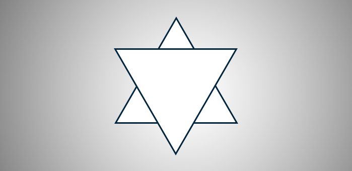
Additionally, triangles have been used in religion for millennia, often as a spiritual or natural symbol. Aristotle, the Greek philosopher, used triangles as symbols for the elements that were thought to make up all matter. The final symbol, ‘Aether’, is made of two opposite triangles on top of one another, symbolising unity and balance.
Who Should use Three Sided Shapes?
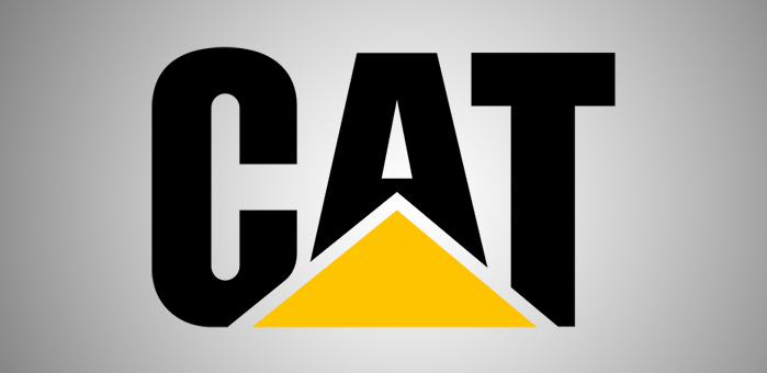
With the duality evident in triangles, there are a lot of businesses that have potential uses for them in their logos. As they convey direction and purpose, industries with a strong tie to these ideals will find the most use from them. These include technology, law, finance, religion, construction and even fashion. The Caterpillar logo is an excellent example of showing stability with their use of an isosceles triangle. The two equal sides with a wider base therefore creating an impression of strength.
Variations
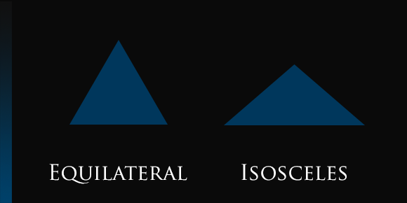
Unlike squares, triangles can come in many forms and these all depend on the lengths of the sides. Depending on the lengths of the sides, different variations and meanings can be portrayed. A wider based isosceles shows stability, whilst an equilateral shows balance and harmony. Due to this it is important to understand the subtle differences in the shapes.
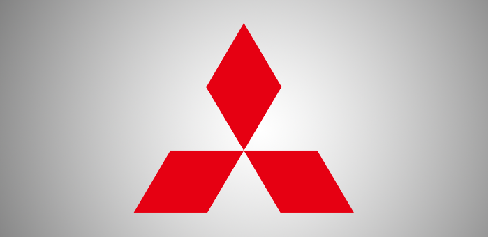
An excellent use of the triangle is in the Mitsubishi logo. At first glance it appears to be made of diamonds, but it is important to see how negative space is used here. Each diamond is composed of two triangles that are each the exact dimensions of the spaces. The overall triangle shape is also scaled to one of these triangles. Through this, the logo speaks of power, stability and precision.
What are the Limitations?
As triangles can be used to show movement or direction, it is important to make sure yours are facing the correct way. They are also often seen as a masculine shape due to their points, so it is worth thinking carefully about their use if your market is primarily female. They can be seen as edgy or exciting, but struggle to fit in with more natural brands.
Understanding how and why to use triangles in your branding is important. They are a strong design choice, but if misused can very easily put people off the brand or product.
If you are looking for more information regarding brand identity, contact us here.