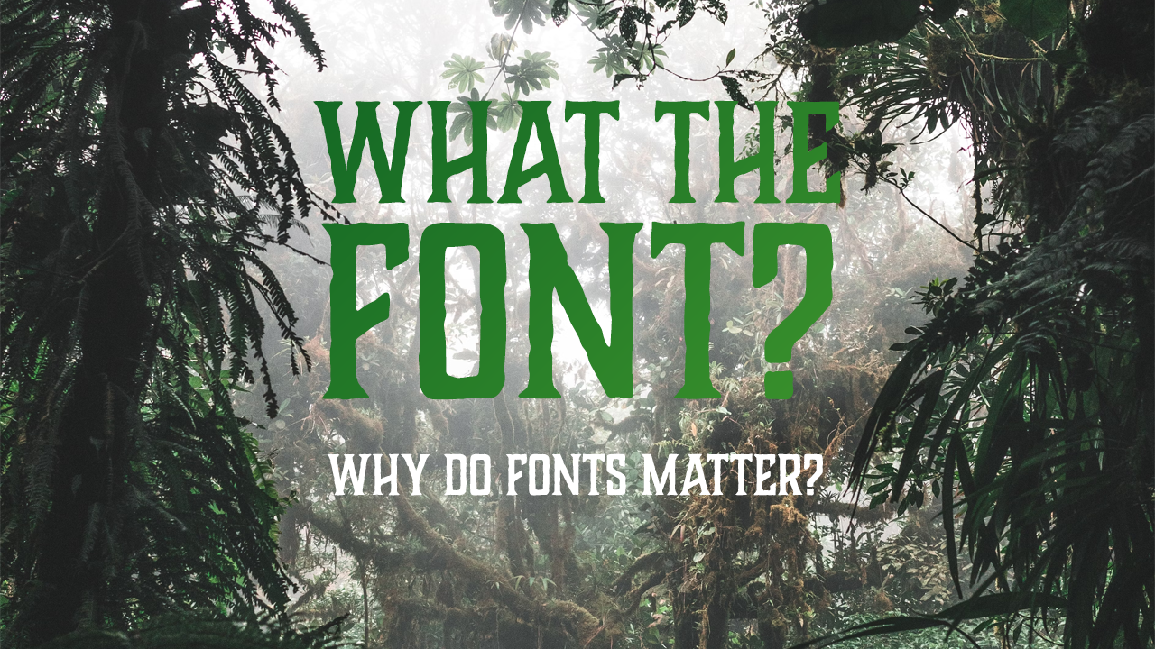
When it comes to your brand identity, font choice is sometimes left at the back of the queue. It’s easy to understand why shape and colour are important, but why do fonts matter?
The simple explanation is that they provide another way for your brand to stand out.
Often, font choices can make or break a brand. Colours and shapes are fairly easy to get the hang of – they are more finite and easier to understand. People (generally) know that blue is a calming colour. We accept that circles show a feeling of community. This all comes under basic semiotics.
Fonts, however, are tricky buggers.
Most people have less understanding of how fonts work. And this means it’s easier to make the wrong choice for your brand.
What is a Font?
Let’s get the first misconception out of the way – a font is actually not what people think.
When people use the term font, they usually mean a typeface. The typeface is the set of glyphs (letters, numbers etc) that share a common design. A font is a set of glyphs within this typeface and includes things like size and weight (bold, italic etc).
Let’s take Marcellus as an example. This is a typeface, made up of glyphs for each letter, number and special character. The font is the specific use of the typeface. Marcellus 12pt regular is a different font to Marcellus 14pt Bold. But, they are the same typeface.
This may sound a little complex, but fortunately most of the time these words are now interchangeable. Even the most pedantic typeface enthusiast knows that when someone says font, they generally mean typeface.
As such, your brand actually uses loads of fonts – often in the same document! The most important thing about them is that they match the tone the rest of the brand is setting.
(Type)Setting a Tone
This is where the magic is. Fonts can be used to set a tone – helping to get across the feelings and voice associated with the brand.
This is where the differences in fonts come into play.
Styles of typeface can be used to create different feelings, themes and overall tone of a brand.
As there are so many fonts, knowing where to begin can be tricky. So the first place to start is with your brand.
Step one to choosing an appropriate typeface is to know your brand inside out. Understand what feelings you’re trying to create, the character and tone of voice you use and the overall impression you want to make.
Once you know all of this, you can begin the fun part of matching fonts to fit the overall tone. Here are some tips for doing that:
Tips for Choosing the Right Font
- Understand your brand – As mentioned above, understand your brand identity before attempting to choose fonts – they have just as important a role to play as shape and colour. Choosing before you know what your identity is can lead to a confused message.
- Be on the lookout for cool fonts wherever you can – when you see a font out in the wild, make a conscious effort to think about what attracts you to it. What do you like about it? How does it make you feel? Does it fit with the message it’s selling?
- Learn about typography – learning the basics of typography will help you when choosing a typeface. You don’t need a huge amount of knowledge to start, but knowing your serif from your sans serif will certainly help you understand what you’re looking for.
- Choose a few fonts and play around – one of the most important aspects of choosing anything in design is having room to play and experiment. Find some fonts you like and see how they act alone, together, as headings or as body text. A healthy approach to discovery will help you find interesting combinations
- Remember to think about versatility – some fonts only come in a single weight so may be unsuitable as body text. Others may look great on screen but not in print. Think about where your brand will be visible and choose a font that works for your marketing.
Why do Fonts Matter?
Like most visual elements, fonts can be used to influence the feelings of a brand’s audience. Take a look at the examples below:
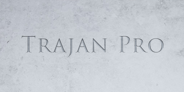
This first example is Trajan Pro – a serif (those little finishing strokes at the ends of the letters). It’s strong, neat and bold, creating an impression of being carved from stone. This creates feelings of dependability and robustness.
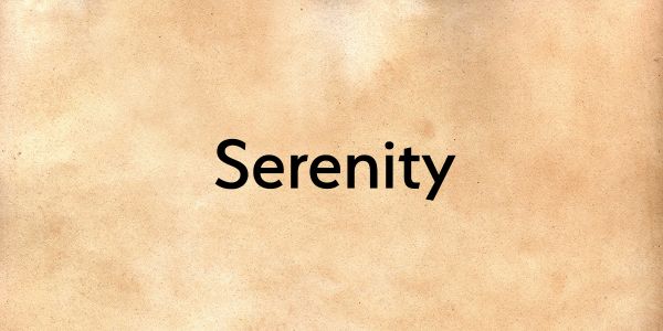
Second, Serenity is a sans-serif (without the finishing strokes). It has lots of different font options, so is very versatile, making it great for large areas of text where italics or bold options are needed. It has a simplicity to it, but still retains a distinct character, making it feel open and welcoming.
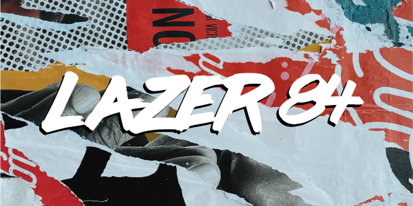
This last example is called ‘Lazer 84’ – it’s a display font that has a scratchy, handwritten feel. It gives an impression of fun or rebelliousness and would work great for brands that don’t want to be seen as stuffy or serious. As a display font, it’s suitable for punchy titles, but not for paragraphs of text.
As you can see, font choice is just as important as colour and shape when building an identity that can create a certain emotion.
Bringing this all together is the key – and using a series of typefaces that reflect your brand message, voice and personality is just as crucial as using the right colours. Font choice can make or break a brand, so taking the time to get it right is worth the effort.
Time to think about renewing your fonts? Book in for discussion here.
Do you want to be updated on my latest news? Click here to subscribe to my newsletter and get more blogs right to your inbox, or follow me on Medium.