That logo you spent ages designing? It needs to be more than pretty.
Great logos don’t just explain what you do; they help audiences identify you from your competition. They’re important parts of a brand identity, but they can’t correct unclear positioning. The best logos are a manifestation of well-defined brand identity.
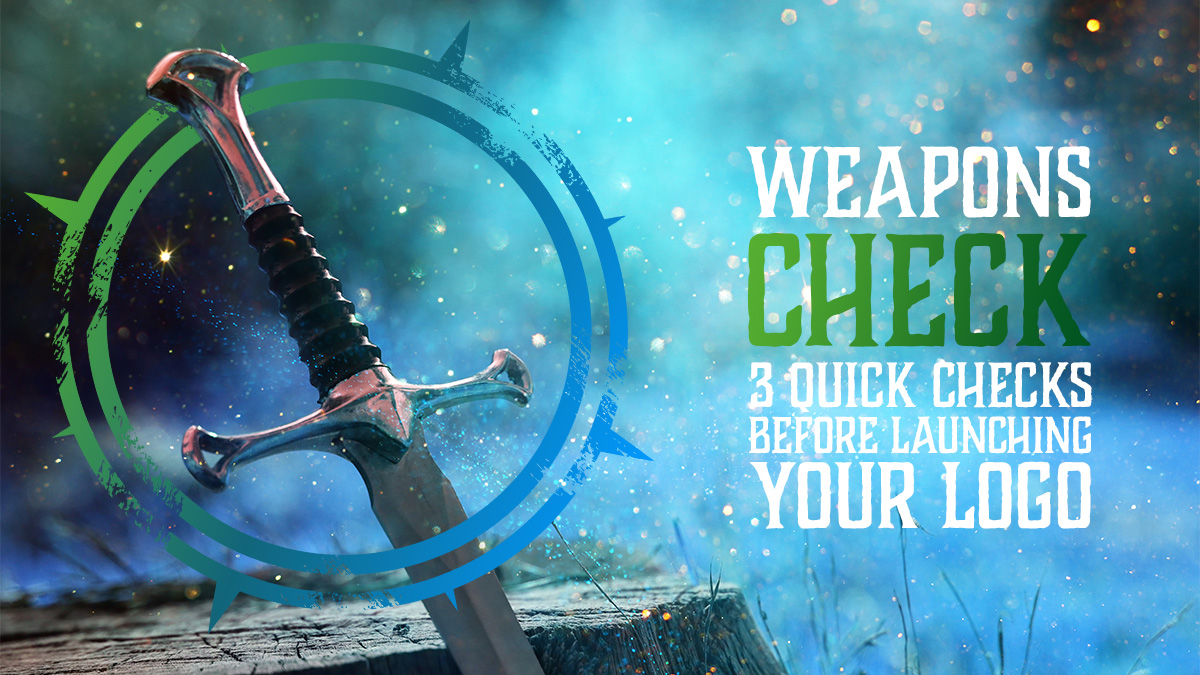
The launch of a new logo is an exciting time for a business. The logo is a key part of customer recall, so it’s natural to feel a mix of emotions. This article outlines three logo checks to help ensure a smooth launch.
A Logo Can’t Fix Unclear Positioning
While a logo is the visual cornerstone of a brand’s identity, it isn’t some all-powerful sigil. Alone, it won’t do much at all. Instead, it acts as a talisman, an icon that reflects the promise and power behind your brand identity.
If there’s nothing behind it, it’s little more than a pretty trinket.
A clear brand message and positioning are vital components BEFORE designing a logo. Understanding what your brand stands for, what your promise is and who you want to attract directs the logo design. Remember, branding is about communication, and your logo should communicate the core essence of your brand.
A great logo reflects the brand’s ideals and reinforces the emotional connection with an audience.
That being said, the logo is often the star of the branding show and will be one of the key pieces an audience recognises. Here are three logo checks to ensure a solid launch for yours.
Quick Logo Check #1: Does Your Logo Make Sense Without Context?
Check one ensures you’ve got something that works logically. Often, your logo will be seen for the first time at a glance or with little surrounding context. This means it needs to be both clear and relevant.
Think about a stranger encountering your logo for the first time. Does it effectively communicate your brand to them? Is the brandmark clear and recognisable? Is there a relevance to your business?
While logos don’t need to explain what you do, they should at least make sense on a visual level. Is the brandmark (icon) consistent in tone with the typography choice? Do the colours appeal to your target market and the emotional connection you wish to create?
Understanding what a stranger sees and how they feel when they first encounter your logo can mean the difference between gaining a customer and not. If they are left confused, they won’t investigate further.
Quick Logo Check #2: Does It Scale Cleanly?
Your logo could be presented in a myriad of locations, from tiny favicons (the icon on your browser tabs) to massive printed billboards. Ensuring it looks right at any scale isn’t just nice, it’s crucial to ensure you always appear like a quality choice.
How many times have you seen a blurry logo and immediately thought slightly less of the brand? I’d wager more than a few. Audiences notice these things and often form snap judgements. A pixelated JPEG won’t cut it for most uses, so ensuring your logo is made in vector format gives you more flexibility.
Not only do you need the right file formats, but the logo itself should have an internal balance, and several options depending on use. Both stacked and wide versions are useful as they can be used in spaces with different directions. The text and brandmark should be carefully scaled proportionally to create internal balance. This logo check is vital to ensure your brand always looks its best.
Quick Logo Check #3: Does It Feel Like You, Not Your Competitor?
Perhaps the most important check is how unique the logo is. If you put it next to your competitor’s, will audiences be able to tell them apart?
You are not alone in your industry. There are hundreds of other options (in most cases) for clients to choose from. If you don’t stand out from them, you’re making it hard for your audience to remember you.
This is where it’s important to understand your unique brand identity. These are the core aspects that make you different: your purpose, values, story and character. A logo that reflects these not only helps you stand out from your competition, but also attracts the right kind of clients to your business.
You know the types. The ones you love working with AND who pay your value.
(If you’ve not had those, it’s a big red flag that you need to look at your brand identity again).
Conclusion: A Good Logo is Armour, Not Decoration
Logos aren’t a decorative piece. They’re functional, protective elements of your brand strategy. A brilliant logo design has the power to build a loyal following, ensuring they never go elsewhere for services you offer.
That’s why spending time on positioning BEFORE committing to your logo is vital. These logo checks help see if you’re there or not.
Knowing where you stand and what your clients want to see gives you direction for your logo and other brand visuals. A deep appreciation of your core identity increases the effectiveness of your logo as a tool for both recognition and connection.
Ideally, you’ll already be in a position where you have the right stuff in place. A unique brand identity with a core purpose, focused vision, and distinct values and character. Without these, even these logo checks won’t help raise your profile.
But if that’s not the case, fixing those areas first will help your logo function as more than a pretty icon. Taking time to prepare ensures your logo truly reflects your unique identity and mission.
Because that’s what your audience will resonate with most.
Need to understand the identity behind your logo? Brand Adventurer is made just for you – a one-to-one workshop designed to uncover and define the core aspects of your brand identity. Find out more about it below.