‘Oh god,’ you think ‘not design jargon’ as you open a reply from your graphic designer.
‘Please, god, no more graphic design terms.’
Every industry has its terms that seem like they’re in a different language (and sometimes are). They can leave you feeling confused and bewildered. You can just imagine the designer’s smugness:
‘What do you mean you don’t know the difference between CMYK and RGB?!’ their imaginary avatar scoffs in your head with a look of obnoxious superiority on their face.
Alright, we’re not quite like that.
That jargon can feel like a colossal wall that prevents you from getting what you need – and often, the designer is just as frustrated when they can’t help you get what you want.
That’s why there are some terms you should know as a small business owner. They’ll help save time on the back and forth, getting the information you (and your designer) need faster.
Knowing design terminology will help you communicate what you need better, resulting in visuals closer to what you want. This is vital for getting the most out of your budget and improves the chances of getting the intended results.
This article acts as a codex of common design terms, translated into easy-to-understand language. You’ll be able to communicate with graphic designers better, getting the results you want faster.
Bookmark this page for future use – it’ll come in handy when translating your designer’s emails!
Common Graphic Design Jargon
Design Terms
Here are a few basic ones that you’re likely to come across in your first interactions with a designer.
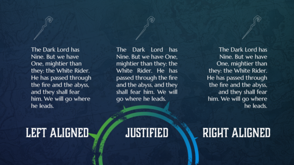
Alignment
Alignment refers to the position of text and graphics on a page. The below image shows examples of left-aligned, right-aligned or justified text and icons.
Balance
In design, elements should be visually pleasing. Evenly distributed elements in either symmetrical, asymmetrical or radial fashions are in balance.
Composition
Composition is the arrangement of elements to create a cohesive design and is also known as the layout. A good composition is visually attractive and helps guide the eye across the design.
Contrast
Noticeably different elements placed near one another create contrast to grab attention and create visually interesting areas.
White Space
White space (or negative space) is an area of a design that is left empty. The use of white space can create contrast and balance in design.
Mockup
A mockup is an image that shows how a design may look when finished. Examples include mockups of clothing to test the placement of a design or labels on a bottle. Mockups are a good way of quickly showing how a final design will look and presenting ideas to a client.
Artwork & Layout Terms
These terms can crop up (see what I did there?) when you commission layout design, such as brochures, banners and flyers.
Bleed
Bleed is a term used in print layouts. It’s a small overprint area to prevent white borders when a design is trimmed or cut.
Trim
Trim refers to the final size of printed artwork once it is cut to size.
Grid
A series of intersecting lines that are used to organise design elements is known as a grid.
Crop
A designer may crop an image to hide parts of it that may be unnecessary in the design or to focus on a particular feature.
Margin
The margin is an area at the edge of a design left clear of text and important elements. This is often to maintain balance.
DPI
DPI stands for ‘dots per inch’. It is a printing term that measures the quality of the print. A higher DPI results in a better-quality print. I recommend using a DPI of at least 300 for most high-quality printing.
Resolution
Resolution is the measure of how detailed an image is. This is based on the total number of pixels in the image.
Colour Terms
Colour is a huge topic, covering aspects of design, psychology and more. For now, I’ll focus on some terms that trip people up when communicating with designers.
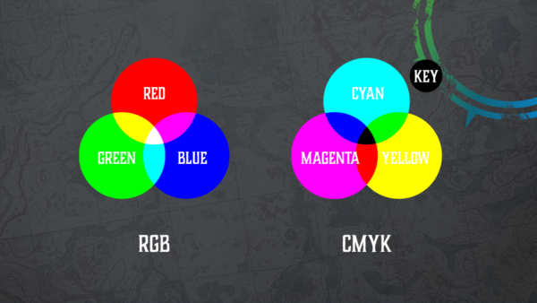
RGB
RGB stands for ‘Red, Green, Blue’. These are the colours that screens emit in varying amounts to display images.
CMYK
In print, the four inks used to make up other colours are Cyan, Magenta, Yellow, and Key (black) or CMYK. The process involves printing specific amounts of each ink to create other colours.
Pantone
The industry standard for matching and communicating specific colours is the Pantone colour-matching system, which is widely used by designers across sectors.
Hue
Hue is a pure colour.
Tint
A tint is a hue with white added.
Tone
A tone is a hue with grey added.
Shade
A shade is a hue with black added.
Warm and Cool
Denotes the ‘temperature’ of colours. Warm colours include reds, oranges and yellows while cool colours are more commonly blues, greens and purples.
Colour Palette
A colour palette is a group of colours that designers and artists select to work together in an aesthetically pleasing way. Designers will often stick to a colour palette to make more cohesive designs. Different palettes can create desired feelings in the viewer.
Gradient
A gradient is a gradual transition between two colours.
Opacity
Opacity dictates how transparent an image is. A lower opacity means a more transparent image.
Typography Terms
Typography covers fonts – and contains a lot of misunderstood graphic design jargon. Many important words relate to typography and how it assists design.
Typography
First, the word itself – typography refers to the art of typefaces. It is the act of carefully arranging letters and text to be both clear and visually appealing.
Typeface
A typeface is a collection of fonts with common visual qualities. Typeface refers to the style of the lettering. You can learn more about typefaces and fonts here. Remember, the terms ‘typeface’ and ‘font’ are often mixed up.
Font
A font is an implementation of a typeface. It’s basically each different weight or point size of the typeface. Arial 12pt is a different font from Arial Bold 12pt, for example. Both are in the same typeface.
Weight
A font’s weight is the overall thickness of the font. For example, thin and bold are two different weights.
Point Size
Point size refers to the size of the font. 1 point is equal to 1/72 of an inch.
Serif
Serifs are small projections that end letters in some typefaces. These are often small lines or hooks.
Sans-serif
Sans is a middle-English word meaning ‘without. So sans-serif literally means ‘without serifs’.
Script
Script fonts typically appear with a flowing or handwritten style, and they often feature cursive letterforms that are joined up.
Slab Serif
Similar to serif, but with thick, geometric projections.
Lorem Ipsum
Designers often use ‘dummy text’, also known as Lorem Ipsum, as a placeholder to indicate the space that the text will occupy before finalising the design.
Kerning
Kerning is the distance between letters in a word. Designers can increase or decrease kerning to create different effects or to make text more legible.
Technical Terms
Alongside the more creative terms, design also has a highly technical side. Here is some technical graphic design jargon that you may encounter.
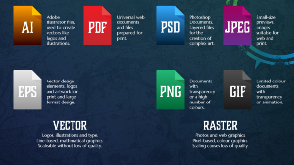
Vector Graphics
Vector graphics use mathematical equations to place lines and points in a 2D or 3D space to form the design. This process allows for scaling of the design without any loss of quality, making it suitable for both small and large-scale projects.
Raster Graphics
Raster graphics consist of pixels arranged in a grid, creating an image mosaic with each pixel having a colour value. They work great for digital art, special effects, and photographs. Keep in mind that enlarging rasters can cause a loss of quality, which can make them unsuitable for certain design purposes.
File Types
AI
Adobe Illustrator files. These are vector files that are commonly used in the design industry.
EPS
EPS stands for Encapsulated PostScript and is another vector file type. Logos and other artwork that may require enlarging use this format.
Portable Document Format. PDFs are a universally accepted file format and most devices can open PDFs thanks to this accessibility. Using PDFs for sharing previews is useful, especially when the client does not have access to specialized design software.
PSD
Stands for Photoshop Document and is a raster format. Designers commonly use PSDs to edit images for use in other designs. They use layers of graphics to create complex artwork.
JPEG
Stands for Joint Photographic Experts Group and is a raster format. Designers commonly use JPEGs for online images and are one of the most common image file formats. They cannot have transparent backgrounds.
PNG
PNG stands for Portable Network Graphics and is a raster format. PNGs do not lose quality when compressed and allow for transparency. They can also support up to 16 million colours, allowing them to be far brighter than GIFs
GIF
GIF stands for Graphics Interchange Format and is a raster format. They support animation and transparency but have far fewer colours than PNGs.
Conclusion – why it’s important to understand graphic design jargon
There we are – a sizeable chunk of common graphic design jargon. It’s not nearly as scary as it first seems.
In reality, the importance of understanding graphic design jargon depends very much on your involvement. If you want to get the best from your designer, knowing what they’re talking about is vital. The results will be better, faster and more likely to help you achieve your goals.
You aren’t expected to know all of this, however. So save this blog post and refer back to it when you need to translate technical terms. I encourage you to use the Sorcerer’s Codex to communicate with designers, marketers and brand specialists.
You’ll find the interactions much easier and more fruitful.
If you’re looking for a graphic designer who you can communicate with, I’m available! Click the button below to book a meeting.