One of the things people remember first about a brand is it’s colour choices. In this series of articles, we’ll be looking at what each colour says about a brand, how it makes people react and what messages it sends. This article looks at the colour green and the brand messages it promotes.
Green is a secondary colour, the product of mixing blue and yellow. It is seen as a ‘cool’ colour, sitting on the spectrum with blue and purple. Cool colours are often seen as reserved and relaxing, often being associated with water and nature.
Going Green
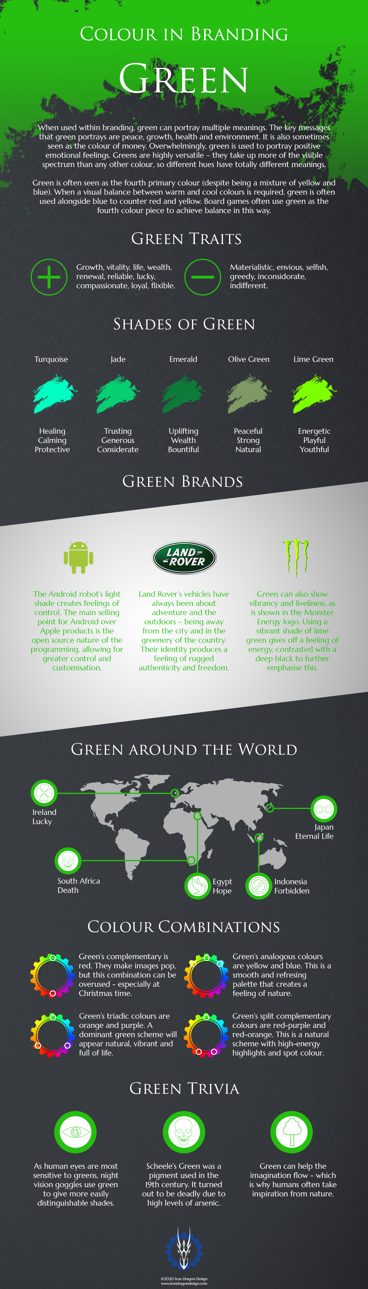
When used within branding, green can hold a few different meanings. Like any other colour, it is important to understand what it is saying to people and that this is the message you are trying to convey. The key messages that green portrays are peace, growth, health and environment. It is also sometimes seen as the colour of money. Overwhelmingly, green is used to portray positive emotional feelings.
Green is often seen as the fourth primary colour (despite being a mixture of yellow and blue). When a visual balance between warm and cool colours is required, green is often used alongside blue to counter red and yellow. Board games often use green as the fourth colour piece to achieve balance in this way.
Tips for using Greens
As with any colours, it is important to understand what your brand message is and whether your colour choices complement this. Greens are highly versatile – they take up more of the visible spectrum than any other colour. This means that different hues can have totally different meanings. Natural greens are refreshing and peaceful, so are great for health and wellness industries or products. If your company has a strong environmental ethos, they will also help portray this to your clients. Bright or neon greens can also be used as statement pieces and are highly eye-catching and engaging in marketing.
Be aware when using greens that you are portraying your message correctly. With so many shades available, it is easy to get your message confused by using the wrong tone. Too much can also have a negative impact, often over use of the colour can create feelings of laziness, so try to use it in moderation.
If you are looking for more information regarding brand identity, contact us here.
Want to be updated on our latest news? Click here to subscribe to our newsletter and get our blogs right to your inbox.


