One of the things people remember first about a brand is it’s colour choices. In this series of articles, we’ll be looking at what each colour says about a brand, how it makes people react and what message it sends. This article looks at the colour orange and the brand messages it promotes.
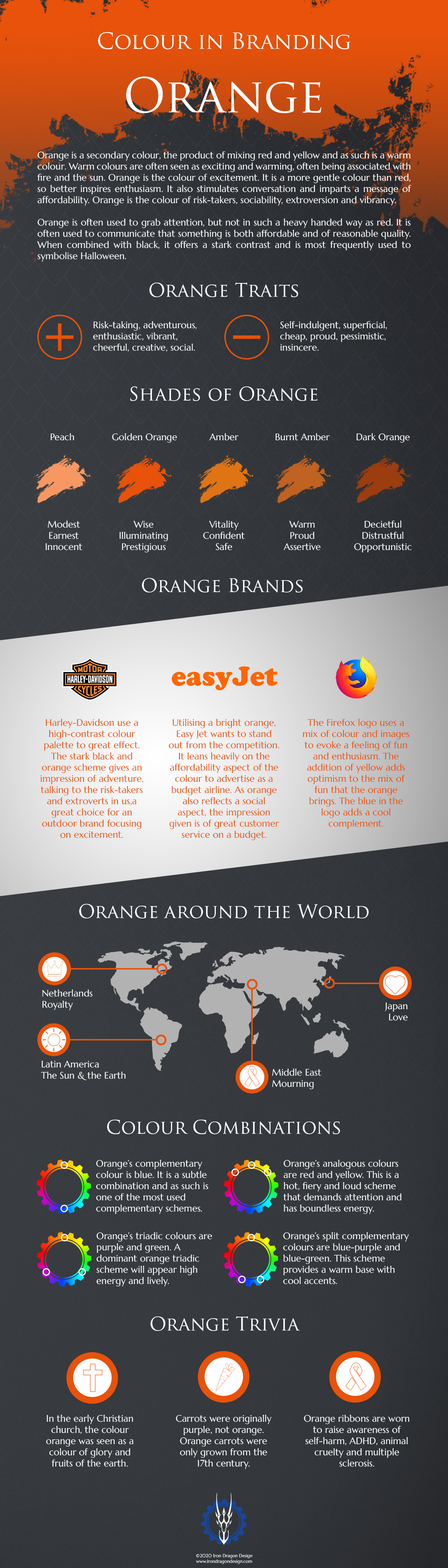
Orange is a secondary colour, the product of mixing red and yellow and as such is a warm colour. Warm colours are often seen as exciting and warming, often being associated with fire and the sun. It is the colour of excitement and is a more gentle colour than red, so better inspires enthusiasm. It also stimulates conversation and imparts a message of affordability. Orange is the colour of risk-takers, sociability, extroversion and vibrancy.
Orange is often used to grab attention, but not in such a heavy handed way as red. It is often used to communicate that something is both affordable and of reasonable quality. When combined with black, it offers a stark contrast and is most frequently used to symbolise Halloween. Check out the infographic below for some more facts about the colour Orange.
Tips for using Orange
As with any colours, it is important to understand what your brand message is and whether your colour choices complement this. Oranges are great for adding a bit of excitement and to your brand identity. While not as versatile as colours like green or red, they exhibit a certain creative flair that can catch the eye in a more subtle manner than the brighter reds. They are great for affordable hotels, restaurants and most importantly, youth-oriented markets.
There are some negative emotions that orange can convey, so it is important to understand these and avoid these messages. Orange can be seen as superficial, so it is extra important to make sure your brand is sincere if you use a lot of it. It can be seen as cheap if used to show value incorrectly. Ensure that if you are trying to use it to show affordability that you still create a professional image. Some shades can also be viewed as pessimistic. Therefore, it is often safer to stick with brighter tones to avoid this.
If you are looking at creating a global brand, it is worth considering what orange means to a worldwide audience. In Latin America it is a vibrant colour synonymous with the sun and earth, while in the Middle East it is the colour of mourning.
If you are looking for more information regarding brand identity, contact us here.
Want to be updated on our latest news? Click here to subscribe to our newsletter and get our blogs right to your inbox.


