When I was about 10 years old, my uncle bought me a Nintendo 64. With it, a copy of The Legend of Zelda: Ocarina of Time. It was a game that captivated me entirely, speaking directly to my love of adventure and fantastical worlds. I still play every Zelda game on release over 20 years on, revelling in the emotive journey that unfolds on the screen. One of the things I noted on a recent play through of Breath of the Wild is how, colour and shape form an important means of evoking emotive responses during the game. This reminded me of how brands work.
We can learn a lot about brand identity through games design as there are some interesting parallels. Like brands, games need to provoke instant emotive responses in their audience. While the reasons are different, the desired outcome is the same – engagement.
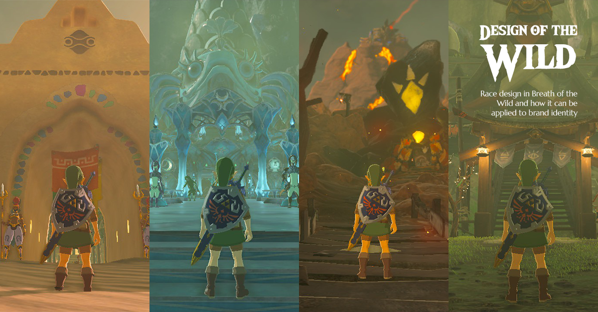
There are several distinct races and locations in Breath of the Wild that are designed to evoke very specific feelings. Below, I take a closer look at four of them; the Zora, the Gorons, the Gerudo and the Shiekah.
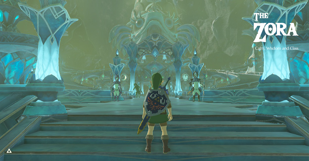
The Zora
Zora are an aquatic race of fish-like humanoids. As could be expected with a water-based race, their colour palette is primarily made up of blues and other cool colours. Silver and lilac are also utilised to great effect. Their architecture uses sweeping curves and complex line based patterns to form a sense of grandeur. The Zora crest is three circles set within connected crescent moons.
The overall effect evokes feelings of calm, awe and a certain sense of wisdom. A blue palette has an instantly calming effect on the viewer. The smooth curves of architecture add to the overall feeling of comfort and luxury. This is further highlighted with the use of line patterns and crescent moon shapes, giving the overall area a sense of wisdom.
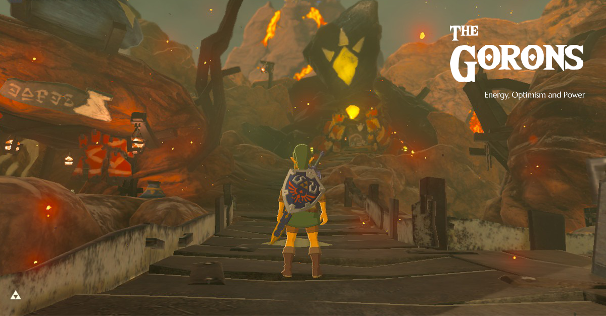
The Gorons
The Gorons are rock-eating miners standing almost twice the height of a man. They live on an active volcano, so unsurprisingly their colour palette is warm. Reds, oranges and browns are the most common colours, with deep black metal to contrast. Their architecture is rough and functional, using organic rocky shapes carved directly from the mountain. The Goron crest is a diamond with three outward pointing triangles.
Despite their outwardly brutish appearance, the use of bright colours and simple, natural forms gives a feeling of energy and optimism. The Gorons are almost universally cheerful folk, and the choice of bright colours reflects this. The use of hand painted triangle patterns also gives a feeling of dynamism and honesty alongside the more obvious associations with power and masculinity. The real strength of the Gorons lies in their openness and optimism and encountering them evokes feelings of cheer and provides energy.
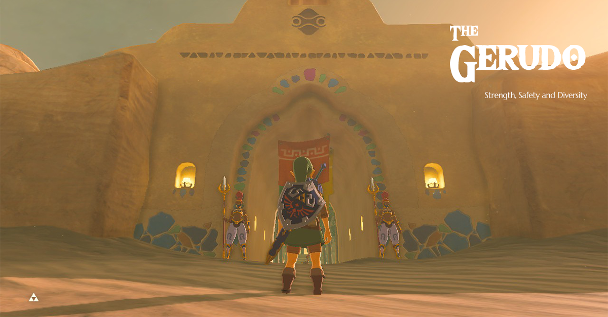
The Gerudo
The Gerudo are a race of fierce warrior women who inhabit a desert oasis. They have a mixed colour palette that utilises predominantly pastel colours with bright spot colours like fiery red hair. Their architecture is utilitarian, consisting of squares and rectangles. This harsh effect is softened through the use of coloured silks. The Gerudo crest continues this theme of ‘warrior culture, with a mask like image.
The use of stable shapes like squares and rectangles gives off a real sense of strength and safety – the Gerudo live in a harsh environment but thrive there. This is softened through the use of pastel colours to provide a feminine feeling. Gold is also important, rendering a feeling of luxury. The variety of coloured silks also speaks of their diversity – in the town square you’ll find warriors mingling with merchants of all races. The use of soft colours on flowing silk is juxtaposed by the hard structures beneath, just like the Gerudo warriors themselves. Overall, the viewer is left with feelings of security and pride.
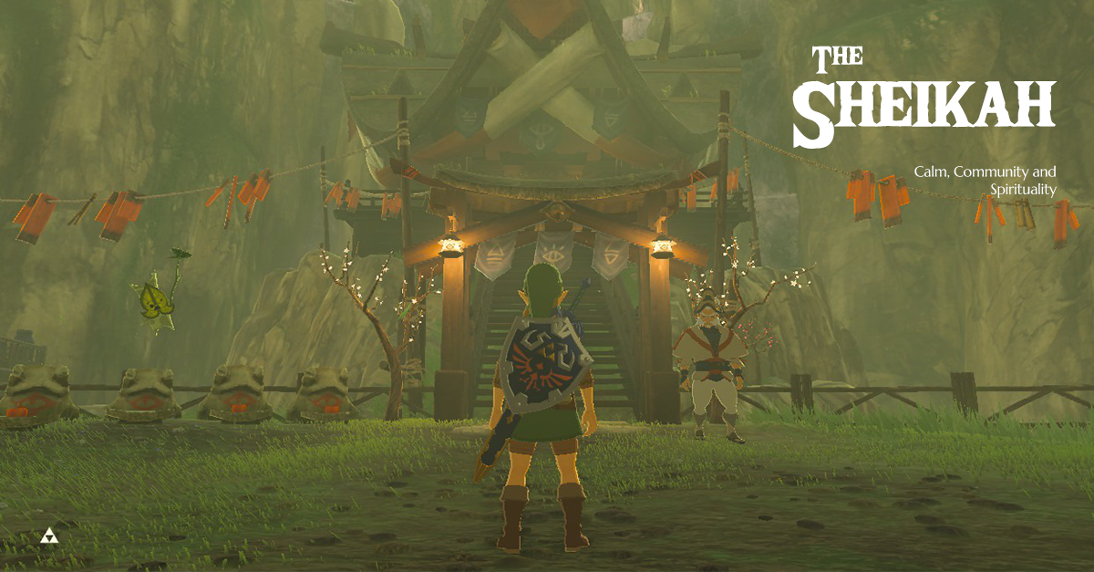
The Sheikah
The Sheikah are, for all intents and purposes, a ninja clan. They are traditional, respectful and dutiful. Their architecture is humble, consisting of raised wooden buildings with thatched roofs. Gently sloping curves are a key visual aesthetic. Their colour palette consists of neutral, earthy tones complemented by blues, purples and red accents. The Sheikah crest is an open eye with a single tear.
The use of tan and other neutral colours gives a feeling of nature and simplicity. However, alongside this, the Sheikah exude mystery and a hint of the mystical. The colour purple is rare in nature, hence it’s position as a spiritual, supernatural colour. They are also creative and imaginative, another trait of the colour purple. You often meet Sheikah inventors and artists across your travels. The feelings of mystery and duty are built upon in their architecture – the deep curves and horizontal lines give a sense of calm and community. These elements together give the viewer a sense of quiet calm with an underlying tone of the mystical. The crest doubles down on this mystic feel, eyes being a semiotic device for spirituality.
So, what has this all got to do with branding?
Games tend to need to impart feelings and emotions quickly, due to their often fast-paced nature and action heavy content. Themes need to be almost instantly recognised by the player so they can get a sense of what’s going on – this is especially important in action based games where quick decisions based off initial reactions are key to success.
Likewise, brands need to be able to show their traits and garner an emotional response from their target market. In the modern age attention span is shorter than ever. A recent study shows a decrease of 33% from 12 seconds in 2000 to around 8 in 2018. Your message needs to get across to your market fast. For that to happen, it needs to be clear and simple.
Your branding is often the first contact you will have with a potential customer, and it needs to speak to them on an emotional level. If a customer feels nothing when they see your brand, they’ll just move on. Looking at how games can create an atmosphere at a glance can give you ideas of how to apply similar principles to your brand. Using colour, shape and semiotics to craft a narrative identity can, when done well, be the difference between being noticed and being interacted with.
It’s important to make sure all the elements of your brand come together in a cohesive manner to really show off your brand values. In doing so, you’ll evoke those emotions and reactions from your audience that will keep them coming back for life.
If you’re looking to put some more magic into your brand identity, check out Brand Adventurer. Learn more below.