People tend to notice colour in logos first, but shapes are just as important. In this series, we’ll look at common shapes used in design and what they mean. This article looks at horizontal lines.
Horizontal lines
Horizontal lines are used to create a strong sense of tranquillity and calm. Their simple, ‘A to B’ structure represents the idea of trust and is commonly used to promote community ideals. Horizontal lines make us think of:
- Calm
- Tranquillity
- Community
- Trust
- Composure
- Dynamism and movement
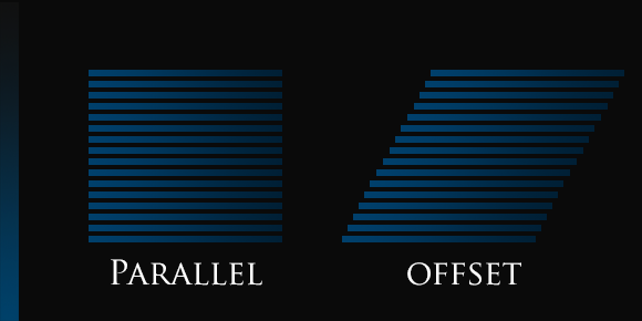
Horizontal lines tend to make us think of typically stoic values, such as trust and composure, but can also be used to denote movement and dynamism. This can often be down to how the lines interact with one another. The examples below use the same number of lines, but their placement denotes a change in ideas. The parallel lines denote trust, while the offset lines show movement. In addition to this, colour can play an important part in changing the meaning of line based logos.
Due to their calming, softening nature, horizontal lines are often employed in designs that aim to appeal to a feminine demographic. Horizontal lines can soften otherwise bold designs, opening them up to a different market.
Who Should use Horizontal Lines?
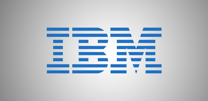
Many types of business should consider the idea of horizontal lines. Due to their inherently trusted nature, they can be utilised effectively by many brands. IBM use a set of lines to show trust and calm by pairing them with blue in their logo. This is primarily achieved through using multiple layers of lines. The earliest iterations of the design were made with lines as Early photocopiers had difficulty reproducing large blocks of ink. These key ideas have been maintained in the modern logo.
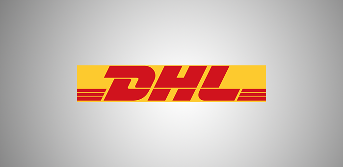
DHL also use horizontal lines. They create a sense of movement in their logo by using offset ends on these lines. It is also evident in their more bold colour palette. They further underline this movement by using a slanted font. These elements combine to create a dynamic logo that also helps to show a trustworthy brand. The single line in the middle of the letters also adds to this movement.
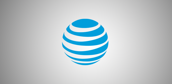
AT&T also use horizontal lines. They are confined within a circle to give the impression of the world. This is perfect for a communications company as the logo gives the impression of a global community. The logo also has some level of dynamism due to the tapered lines. This gives the brand a uniquely modern and trusting appearance.
What are the Limitations?
Horizontal lines can appear soft and calm, so they do not work so well for more vibrant, exciting brands. They can be over used so can also look common. It is also important to look at line thickness. Lines that are too thick can come across as cumbersome. Lines that are too thin can look flimsy.
It is important to understand the pros and cons of horizontal lines. Understanding your brand is the key to recognising if they fit your message. Though they are calm, if this is the message you wish to convey, they can be a strong choice.
If you are looking for more information regarding brand identity, contact us here.