One of the things people remember first about a brand is it’s colour choices. In this series of articles, I’ll be looking at what each colour says about a brand, how it makes people react and what messages it sends. This article looks at the colour purple and the brand messages it promotes.
Purple is a secondary colour, the product of mixing red and blue. It is seen as a ‘cool’ colour, sitting on the spectrum with blue and green. Cool colours are often seen as reserved and relaxing, often being associated with water and nature. Although traditionally seen as a cool colour, it has warmer tones through the addition of more red.
Purple Power
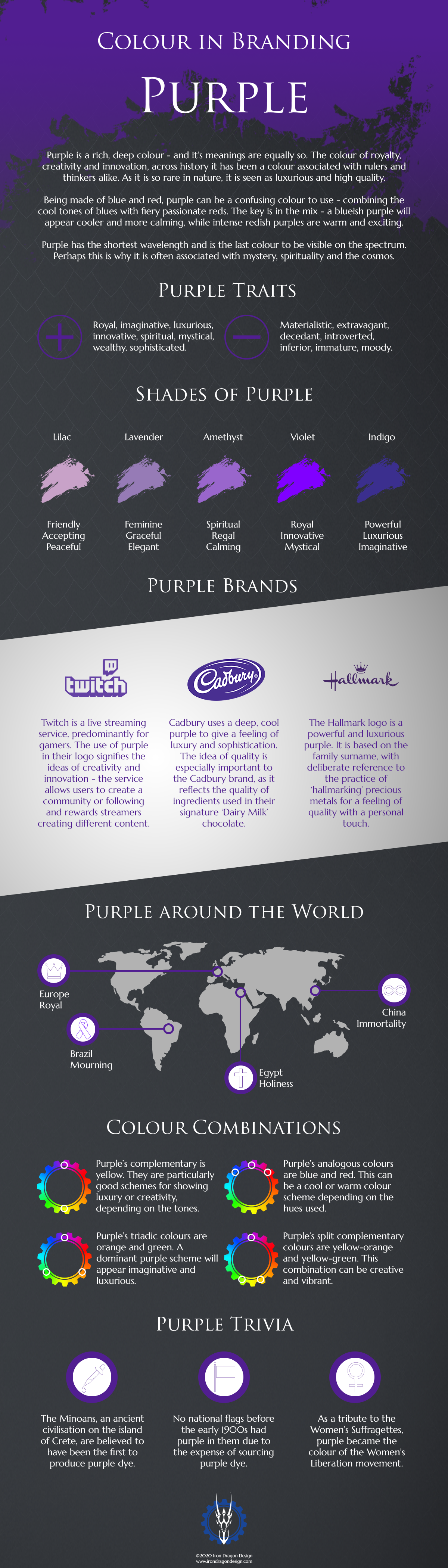
When used within branding, purple can hold a few different meanings. Like any other colour, it is important to understand what it is saying to people and that this is the message you are trying to convey. The key messages that purple portrays are luxury, innovation, spirituality and mysticism. It is also sometimes seen as a wealthy colour, due to how hard it was to produce before the 1900s. Overwhelmingly, purple builds feelings of quality.
Purple is a rich, deep colour – and it’s meanings are equally so. Using it can be tricky due to the conflicting natures of it’s component colours. As such, like most colours, it’s important to understand what each tone represents. More blue provides a cooling effect, while more red adds warmth and sophistication.
Tips for using Purple
As with any colours, it is important to understand what your brand message is and whether your colour choices complement this. Purple has the shortest wavelength of any colour, so we perceive it last. As such, it’s not ideal for brands who want to draw attention to themselves in a loud manner. It’s a more subtle colour that creates an almost mystical feeling. Brands that want to show a more spiritual side can use it to great effect.
As with other colours, different hues can have totally different meanings. Pale, pastel purples, like lilac and lavender, are feminine, graceful and welcoming and are great for self care products. The bolder tones of amethyst and violet are more regal and mystical, so work great for more luxurious products and brands. The deeper indigo hues are powerful and imaginative and are often used by creatives.
Be aware when using purples that you are sure you’re attracting people. As it is seen last by the human eye, it can sometimes be overlooked when placed next to red and orange. However, it’s subtle self-assuredness can also be a great strength, attracting those who want a little more magic in their lives. Overall, be sure that the balance between red and blue is correct for the message you’re attempting to show.
If you are looking for more information regarding brand identity, contact me here.
Want to be updated on my latest news? Click here to subscribe to my newsletter and get the latest blogs right to your inbox.


